Converting Fitness Into Longevity
You have the test, the trend, and the cadence — now: what does a ten percent improvement in the number actually buy? This page does that math plainly, places it on the fitness-mortality curve, and then works just as hard on the caveats, because the epidemiology lives in groups and your life happens one person at a time. The deep mortality data lives on the VO₂ Max topic; this page is the exchange rate.
What the evidence supports
- Higher cardiorespiratory fitness consistently associates with lower all-cause mortality in large, long-running cohorts.
- The risk gradient is steepest at the bottom of the fitness distribution — the largest relative differences sit between the least and moderately fit.
- A ten percent gain in VO2 max is realistically attainable for most previously untrained adults within a focused first block of training.
What remains uncertain
- These are observational associations — fit people differ in many other ways, and no amount of adjustment fully untangles fitness from the rest.
- Whether a given training-induced gain translates into mortality benefit in already-fit people is far less settled than the bottom-of-the-curve story.
- Group slopes cannot predict an individual's outcome; a ten percent gain is a reason for encouragement, not a certificate of immunity.
Evidence last reviewed: August 15, 2026. Conclusions may change as new research is published.
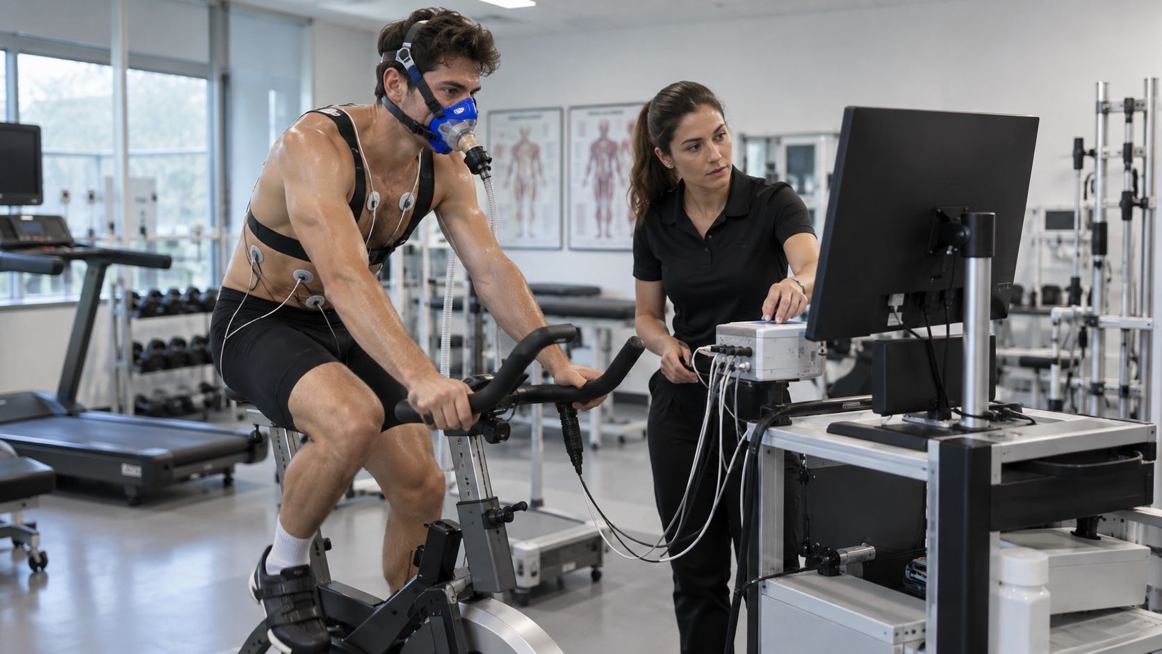
The Ten Percent Math
Start with a concrete adult: a forty-year-old at 35 ml/kg/min, a typical sedentary-to-average reading. Ten percent of 35 is 3.5 ml/kg/min, and 3.5 ml/kg/min equals one MET — the standard unit of exercise capacity, the oxygen cost of sitting quietly. So a ten percent improvement is literally "one MET of capacity gained." In the relevant cohorts, differences on the order of a single MET sit at the heart of the fitness-mortality association: people a step or two apart in measured capacity differ, as a group, in all-cause mortality over the follow-up years (Myers et al., NEJM, 2002; Blair et al., JAMA, 1989). The honest phrasing matters: these are group differences in an observational setting, and the VO₂ Max topic owns the full detail — including the residual-confounding caveat that never fully goes away.
Two readings of that chart. The mechanical one: ten percent buys you more absolute capacity the higher you begin — a small arithmetic consolation, not a suggestion to inflate your baseline. The honest one: for a sedentary adult the same ten percent is doing the most relative work, because of where it starts on the curve.
Why the Curve Is Steepest at the Bottom
The fitness-mortality relationship is not linear; it bends steeply at the low end and flattens as fitness rises. The headline consequence, consistently reproduced across large cohorts, is that the largest relative differences in risk sit between the least fit and the moderately fit — moving out of the bottom tier buys far more than polishing the top tier. For someone at the bottom of the distribution, a ten percent gain is not a marginal nudge; it is a move up the steepest part of the slope, where a little improvement carries the most weight. The VO₂ Max topic has the curve, the numbers, and the effect sizes; the practical meaning for this series is simpler: the people with the most to buy from ten percent are the ones who need training most, and they are the ones whose trend lines typically rise fastest at the start.
What a Gain Actually Takes
The realistic time budget depends entirely on where you start. It is worth being specific, because the swing is large:
| Starting point | Ten percent gain takes | The honest read |
|---|---|---|
| 🌱 Untrained or low fitness | Often a single focused block — a few months of consistent base work | Most attainable |
| 🚴 Regular exerciser, a few years in | Closer to a year of deliberate structure, and the gain shrinks | Harder, slower |
| 🏆 Well-trained, a decade plus | Ten percent over years, if at all — holding the number is the win | Maintenance |
The trainability evidence — the HERITAGE study's demonstration that response varies widely between people (Bouchard et al., 1999) — is the reason to hold this table loosely. Your row is decided by your trend, not by a chart; the trend page's three-test rule is how you find out which row you're actually in.
What the Ten Percent Buys, Week to Week
Beyond the cohort statistics, a real gain shows up in the ordinary arithmetic of your days. One MET of extra capacity changes the grade on the stairs, the speed at which you catch your breath on a walk, the buffer you carry into a hard week, and the number of steps you can absorb before fatigue. These are the same small upgrades the 3-2-1 weekly formula assembles into a training life. The longevity ledger runs on the cumulative side of that arithmetic: not one heroic season, but a decade of holding the line higher than the sedentary slope would have set it — which is exactly what the parent page's year-over-year tracking is designed to show you.
⚖️ Read the group curve as motivation, not prophecy
Every cohort number on this page describes a group: people two METs apart differ, on average, in mortality over years of follow-up. It cannot tell you what your particular gain means for your particular future, and no honest source will convert it into a guarantee. What it can do is rank the size of the opportunity — and it consistently says the cheapest longevity purchase in the fitness aisle is moving off the bottom of the curve. That is a motivation with real epidemiology behind it, and it needs no prediction attached.
The Exchange Rate, Summarized
- 💪 Ten percent equals one MET — the standard unit of capacity, and the size of a realistic first block for most untrained adults.
- 📉 The bottom pays most — the steep part of the curve means the same ten percent does the most relative work where fitness is lowest.
- 🗓️ Time-to-gain scales with training age — months for the untrained, a year for regular exercisers, maintenance for the well-trained.
- 🧭 The durable win is the held line — consistent training roughly halves the age-related decline, and that decade-long slope is the number worth converting.
The One-Percent-Per-Year Alternative
There is a quieter version of this whole exchange that suits people who have no appetite for a focused block. Instead of hunting a ten percent jump, aim for one percent per year, every year, through middle age — the compounding of a held line. Ten years of that outruns the sedentary slope, which is drifting the other way at roughly ten percent per decade. The arithmetic is unglamorous and it is honest: consistent effort that merely keeps a healthy number steady across a decade is, in cohort terms, a meaningful gap versus the average trajectory — and it is exactly the pattern the parent page's year-over-year log is built to display. The ten percent jump and the one-percent-per-year program are not rivals; they are the same exchange rate used at two different life stages.
Questions, Answered Briefly
- 💪 If I improve ten percent, do I get ten percent less risk? No — that is not how the curve works. The relationship is nonlinear and observational, which is why this page leans on rankings of opportunity rather than arithmetic reductions. The honest summary is direction and size, not a precise discount.
- 🧮 Is one MET really a big deal? In the cohort literature, capacity differences at this scale are associated with meaningful mortality differences across groups — and in daily life, one MET is the difference between breezing up stairs and stopping to breathe. Both readings are true.
- 🏃 Do I even need the test to get the benefit? No — the training is what buys the outcome; the test is the receipt. If testing itself has lost its usefulness, keep training and skip the measurement; the longevity ledger does not care whether you logged the receipt.
- 🕰️ I'm starting at sixty — is ten percent still available? The trainability evidence shows older adults respond to training with smaller ceilings but real gains, and the honest read is even better news: at the bottom of the fitness curve, where many late starters sit, the same relative improvement is doing its largest relative work.
The Bottom Line
- Ten percent of a mid-range adult reading is one MET — 3.5 ml/kg/min, the standard unit sitting at the heart of the fitness-mortality association.
- The curve is steepest at the bottom — the same gain does its largest relative work where fitness is lowest, which is where it is also fastest to achieve.
- Attainability scales inversely with training age — a block for the untrained, a year for regular exercisers, and simply holding the line for the well-trained.
- Treat group curves as motivation, not prophecy — the epidemiology ranks the opportunity's size; your trend tells you what you personally bought.
Related Topics
- Blair et al., "Physical fitness and all-cause mortality: a prospective study of healthy men and women," Journal of the American Medical Association (1989)
- Myers et al., "Exercise capacity and mortality among men referred for exercise testing," New England Journal of Medicine (2002)
- Bouchard et al., "Familial aggregation of VO2max response to exercise training: results from the HERITAGE Family Study," Journal of Applied Physiology (1999)